One mission, one voice: Archdiocese launches new logo
By Sally Krause
 They say a picture is worth a thousand words. Indeed, the words we choose and the visuals we use shape how people experience our archdiocese—and ultimately, our Church.
Since 1994, the archdiocesan logo has been a blue window with panels suggesting the variety of communities across central and southern Indiana. It was created by the late Benedictine Father Eric Lies, an artist-calligrapher of Saint Meinrad Archabbey in St. Meinrad; it was modified into the shape of a stained glass window by Jane Lee, a graphic designer with the archdiocese at the time. While that visual has served us well, it began to feel dated.
An archdiocesan-wide communication study, completed in the spring of 2024, laid the groundwork for change by providing a deeper understanding of parishioner communication needs and preferences. Among the discoveries was a need to update our archdiocesan identity.
Jennifer Bradley, an Indianapolis designer with more than 20 years of experience, designed the new look.
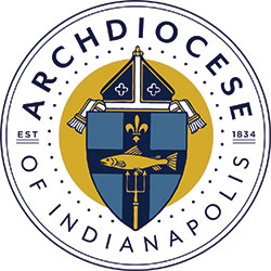
The updated logo is a modern interpretation of the archdiocese’s historic coat of arms, honoring our heritage in central and southern Indiana while introducing relevant new elements.
Anchored by the original design commissioned in 1934, the shield reflects faith and tradition. A Marian blue cross proclaims the Gospel and the fleur-de-lis honors French missionaries and early bishops. The fish with trident recalls Native American roots, remembering the Algonquin tribe whose name means “place of spearing fish.”
Crowned by a bishop’s miter, the shield signifies episcopal authority. New features include 38 points encircling the emblem, representing the Indiana counties within the archdiocese that have a parish, and the founding date, which grounds the design in its enduring mission.
Finally, in the tradition of coats of arms going back centuries, blue and gold are French heraldic colors, a reference to the first Catholic explorers and settlers of the archdiocese. Blue also symbolizes faith, while gold represents wisdom, generosity, glory and constancy.
With its first appearance on the cover of the 2026-2031 pastoral plan, the new logo unites the Archdiocese of Indianapolis as one community with one mission in central and southern Indiana—to joyfully proclaim the Gospel of Jesus Christ to all people by living his mission of mercy, hope and salvation.
(Sally Krause is executive director of communications for the Archdiocese of Indianapolis.) †